2026 Design system

Beeline corporate brand guide

Your feedback is a gift–please share your thoughts on this design system or the Claude design skill with us. We are here to help!

Infographic 1-1-1

Corporate    |     Enterprise     |    Professional    |    Supplier Network    |    MBO Partners    |    JoinedUp

Beeline employees only

Employee templates & assets


Powerpoint

To access the Beeline Powerpoint template open the Powerpoint desktop app.

  1. Go to + New

  2. Select the Beeline template


Word

To access the Beeline Word template open the Word desktop app.

  1. Go to + New

  2. Select the Beeline template


Logo


Logos can be downloaded here.

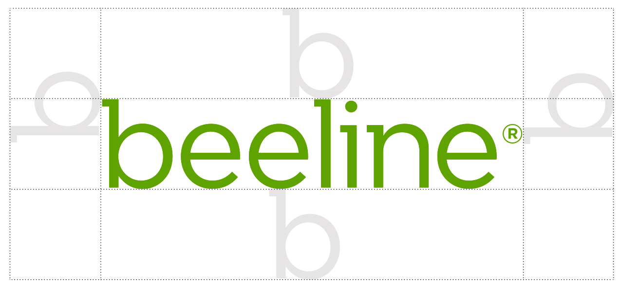
Our name is crafted in lower case contemporary lettering to give it a warm, human personality. The logo text is built with a custom font that is based on the Gotham font family. The logo text is Beeline Green #5fa300. The Registered mark protects our brand. It is aligned to the top of the 'e'.

To ensure the logo type is always clear and legible, minimum sizes are set for print and electronic/on-screen applications. The sizes are measured from the left-hand edge of the ’b’ to the right of the registered mark in the Beeline name.

Minimum size:

beeline-text_5FA300

Print 1.18 inch
30mm

beeline-text_5FA300

Digital 100px

The Beeline logo should always be surrounded by an area of clear space so that text, images, or graphic elements don’t overpower it. The clear space is defined by the height of the ‘b’ in our name.

Beeline logo clear space

Backgrounds

Our logo works best in color against a white or dark background where there is enough contrast to achieve maximum standout.

Icon

In 2024, we introduced a new green ‘b’ icon to use at the brand or platform level in isolation or standalone, and not in combination with our logo.

Beeline icon

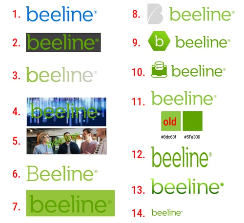
Incorrect logo usage

Do not:

1. Change the color of our logo

2. Put a box around our logo

3. Fade the logo

4. Place the logo on a busy background

5. Use our logo as a watermark or photo effect

6. Capitalize the logo

7. Put the green logo on a green background

8. Use the old B icon next to the logo

9. Use our new icon next to the logo

10. Use any icon next to our logo

11. Use the old, lighter green HEX #8dc63f. It must be darker green HEX #5fa300

12. Warp our logo in anyway

13. Add a gradient to our logo

14. Change the logo proportions

Beeline Brand guidelines Oct 22 2025-14 copy
Under NO circumstance may the Beeline icon be used in conjunction with the Beeline logo
Logo donts (3)

Typography


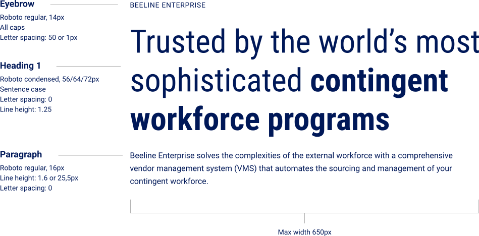
The Roboto font family can be downloaded here.

Digital

Tags and eyebrows:
Roboto regular, all caps 14px

Paragraph (desktop and mobile):

Roboto regular, 16px
Line height: 1.6 or 25,5px
Letter spacing: 0
Color: #0C0C0C (97% black)
Inverted color: white #ffffff
Inline links: Bright blue #0357fc, bold
Inverted inline links: Mint green #7df98c, bold

DS typography 3

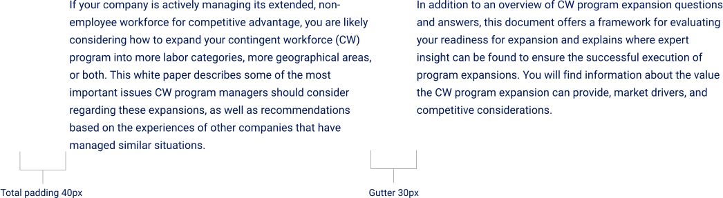
Two column layout

DS type para

Headings:

Roboto Condensed regular
Sentence case
Line height: 1.25
Letter spacing: 0
CSS: clamp
Color: Navy #001858
Inverted color: #ffffff
Bold can be Mint Green #7df98c

*Note: Heading 1 may be used at 56, 64 or 72px depending on the usage and amount of copy

Clamp Maximum:

Heading 1: 72px

Heading 2: 48px

Heading 3: 36px

Heading 4: 26px

Heading 5: 20px
Heading 6: 18px

Clamp Minimum

Heading 1: 40px

Heading 2: 32px

Heading 3: 24px

Heading 4: 18px

Heading 5: 16px
Heading 6: 16px

Labels and tags

For website labels we use the below parameters. For graphics, ads and social, other background colors may be used so long as they are accessible. All caps may be foregone for longer labels.

Website UI: Resource labels

White paper

Roboto medium 14px
Sentence case
Letter spacing: 0
Color: White #ffffff
Background default color: Bright Blue #0357fc
Corners: 5px border radius
Padding: 5px top/bottom; 10px left/right

Website UI: Date labels

August 7, 2025

Roboto medium, 14px
Letter spacing: 0
Text color: Navy #001585
Background color:  Blue grey #F5F6FA
Border: 1px Grey - 80* #DDDFE6
Corners: 5px border radius
Padding: 5px

Website UI: Date labels inverted

August 7, 2025

Roboto medium, 14px
Letter spacing: 0
Text color: White #ffffff
Background color:  White #ffffff at 20%
Border: 1px White #ffffff at 40%
Corners: 10px border radius
Padding: 10px


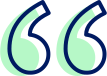
Quotes

Large quote icon is featured on left side or above text (on mobile or if text is centred). Quoted text is left aligned Roboto 24px, line spacing 1.5. Author is Roboto Bold 18px. On dark backgrounds the text will be white and the white version of the quotation mark must be used. You can find the quotation mark here.

Quote mark in icon style

"The Beeline team is exceptional. They understand our business and represent us with confidence and credibility when engaging potential clients."

— TalentProcure

Quote mark in icon style
"The Beeline team is exceptional. They understand our business and represent us with confidence and credibility when engaging potential clients."

— TalentProcure

Callout style 1

This simple style can be used in any context.

Font: Roboto regular
Size: 24px
Color: Black Navy (or white on dark)
Alignment: any
Max width: 700px unless it is a large amount of text, in which case the width can be increased to reduce the lines of text to 3

The organizations that govern their full workforce today will define the competitive landscape for the next decade.

Callout style 2

This box style can be used to add color and draw attention.

Font: Roboto regular
Size: 18-20px
Color: Black Navy 
Alignment: left
Max width: 700px unless it is a large amount of text, in which case the width can be increased to reduce the lines of text to 3

Box: 
Callout boxes have a 1px stroke and a color fill. Corners are 14px.

Color options are:
Light Mint #dcfde0 with stroke Pastel Mint* #a8fbb2
Blue 80 #B9D6FF with stroke Blue 60 #5FA1FF
Blue 90 #E6F0FF with stroke Blue 90 #E6F0FF

The organizations that govern their full workforce today will define the competitive landscape for the next decade.

Section content module

Your extended workforce. Full force.

With a range of solutions for managing today’s external workforce, Beeline empowers businesses to deliver leading contingent workforce programs.

Example of a link.

Colors


Primary colors

Our token primary color for Beeline and Beeline Enterprise is Beeline Green #5fa300. Our token neon color is Mint Green* #7df98c. These colors are the identifiers for Beeline and BE and must be featured. They may be used in small and medium-sized areas, including backgrounds of graphics.
*Used on Beeline Enterprise product

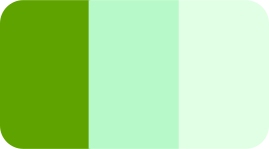
Beeline Green #5fa300
Buttons, accents

Mint Green #7df98c
Bold type, links on dark

Pastel Mint #a8fbb2
Cards

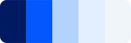
Bright Blue #0357fc
Tags, accents

Blue - 80 #B9D6FF
Cards

Blue - 90 #E6F0FF
Cards

Neutral colors

These colors may be used in areas small to large, including section backgrounds. They are be used to support the primary colors, differentiate sections and help present information. *Used on Beeline Enterprise product

Black Navy #000f32
Backgrounds

Navy #001858
Titles, gradients

Blue Grey #F5F6FA
Backgrounds

White #ffffff
Backgrounds, cards

Examples

Screenshot 2026-06-10 at 10.44.43
Screenshot 2025-12-10 at 11.23.35

Secondary colors

These colors indicate different areas of our products and services. Please note and adhere strictly to the affiliations. Blues and greens may be used across all areas.

Green = contingent workforce

Green 20
#448500 AA

Beeline Green
#5fa300 A

Mint Green
#7df98c

Pastel Mint
#a8fbb2

Light Mint
#dcfde0

Sky Blue = outsourced services

Sky Blue
#00adee
AAA

Sky Blue - 80
#BEEEF9
AAA

Sky Blue - 90
#E0F5FD
AAA

Blue = consultants and SOW

Blue 30
#0340BF

Bright Blue
#0357fc AA

Blue 60
#5FA1FF

Blue 80
#B9D6FF

Blue 90
#E6F0FF

Purple = supplier networks

Purple
#6325f4

AA

Purple 2
#ae00ff

AA

Purple - 80
#e2c4ff
AAA

Purple - 90
#f5edff
AAA

Pink = MBO, independent contractors & compliance

MBO Pink
#e20072

MBO Pink 2
#ff6dfa

MBO Pink 3
#ffbeff

Pink 90
#ffeefd

Orange = shift work

Orange
#ef6103

AA Large txt, UI

Orange 2
#fdd40d
AAA

Orange - 80
#ffde9b
AAA

Orange - 90
#FFF2E3
AAA

Purple used to indicate AI only

Purple 10 #5127A5
Header text, solid icon

Purple 30 #6B39D0
Button fill

Purple 50 #906ADC

Purple 70 #B59CE8
Card borders

Purple 80 #DBCDF4

Purple tint #ECEFF9

Grey 10
#3A4256
Text

Grey 30
#717480
Text

Grey 50
#9a9da8
UI elements

Grey 70
#c6c8d1
Line & borders

Grey 80
#DDDFE6
Text

Blue Grey
#F5F6FA

Negative marketing color

If marketing wishes to create a negative graphic (for example a negative notification on a graphic for an advert) this color scale may be used. 

Red
#db0000

Red - 60
#f75454

Red - 70
#ffa0a0

Red - 90
#FFE4E4

Gradients

This gradient may be used in small and medium-sized areas.

Mint Green #7df98c to Beeline Green #5fa300

Color pairings

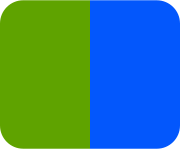
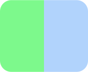
Please pay attention to which colors are ideal to pair adjacent to each other, and which aren't. When two colours (excluding white) are adjacent there must be a contrast ratio of at least 1.32:1.

Examples of colors that are okay to pair:

Pairing blue

  Pairings BGPairing green Pairings mint


Examples of colors that are not okay to pair:
Pairing no 6
Pairing no
Pairing no 2
Pairing no 5
Pairing no 4
Success story graphic-3

Icons


Functional icons

We use Font Awesome for check marks and crosses, size: 30px. Download them here.

   White check on Beeline green #5fa300

   White cross on Error red #db0000

   Arrow height is 30px

Social icons

Screenshot 2026-05-01 at 15.36.13

Size: 24px
Background color: Navy #001858


Share icon

Icon share on light

Size: 35px
Background color: Blue grey
Border color: Grey - 80*
Border wight: 1px
Icon color: white


Share icon inverted

Icon share2

Size: 35px
Background color: White 20%
Border color: Grey - 80*
Border wight: 1px
Icon color: white

Pattern


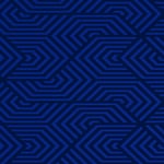
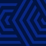
This is our brand pattern, you can download it here. It may be used in section backgrounds, graphic backgrounds and graphic elements. The pattern must always be on a #000f32 color background, and may either be #081f6a or a gradient from #081f6a through #001858 to #000f32.

Pattern: Radial gradient bottom right #081f6a through navy #001858 to Black Navy #000f32 on background Black Navy #000f32

Pattern: #081f6a on Black Navy #000f32

Do not:
pattern do not big

Do not enlarge

pattern do not pix

Do not pixelate

pattern do not stretch2

Do not stretch

pattern do not color2

Do not change the color or saturation

pattern as background example

Deliver better outcomes with trusted experts.

Imagery


Photography:

View our image libraries here.
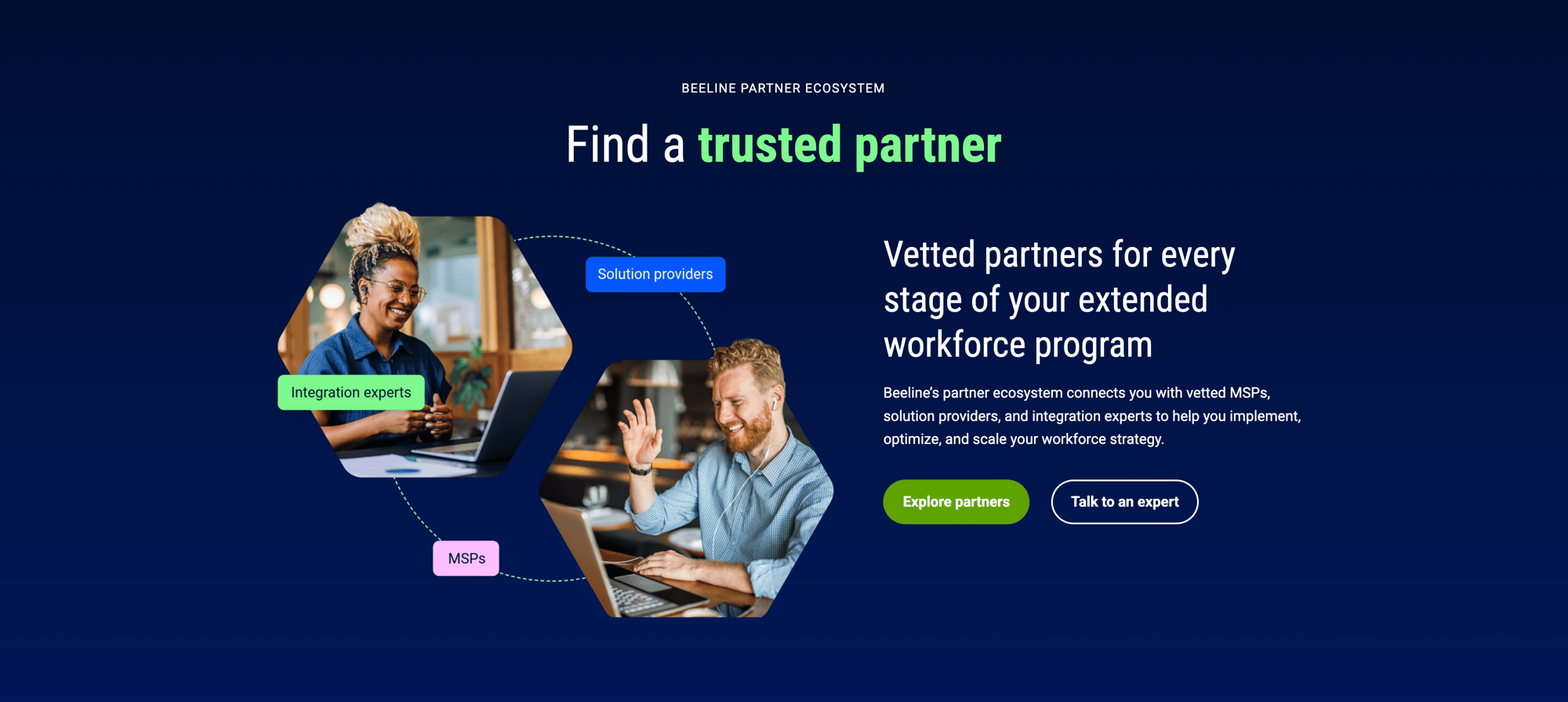
When a photograph of a subject is used, they must always face towards the content.

Ideal images
  • Images must be relevant to the subject.

  • They may be literal images of people using devices or technology, or more conceptual/life-style driven.

  • We strive to use photography that is authentic, confident, candid, clean, friendly and warm. Headshots may be used in designed graphics.

  • It is important to represent diversity of gender, race, and age
MBO graphic-2 (4)2
Rectangles-1
Images to avoid
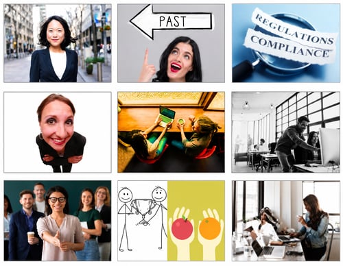
  • Images that look 'stocky' or too posed. 

  • Images that are obviously altered eg. lighting effects, color overlays, altered color or background removed

  • Illustrations from stock sites

  • Subject looking at the camera (unless it is a headshot being used in a graphic)

  • Strange angles

  • Images with text in them

ChatGPT Image Jul 15, 2026, 10_37_03 AM

Key style elements:

These unique elements are a key part of making our brand recognisable.

Hexagons-3-Enterprise page 2

1. A part of the human subject may reach outside of the image frame.

Rectangles-11-iStock-2223201247 rectangle

2. A rounded square, rectangle or hexagon mask may be used

Rectangles-2

3. A brand hexagon may be inserted behind a subject. Shadows must be added to make the hexagon look realistic in situ.

Success story graphic 2-4 (2)

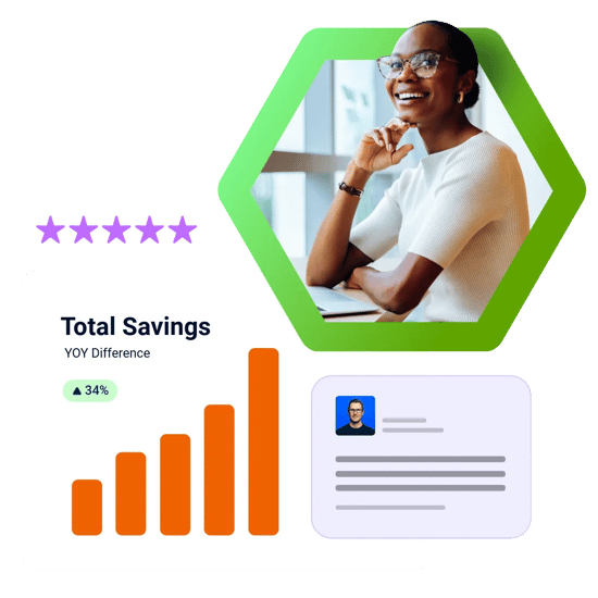
4. A combination of the brand hexagon, hexagon mask and subject reaching out of the frame may be used.

CTA buttons


All buttons are:

Font size: 16px
Text align: center
Font weight: bold
Border radius: 40px

Please note button text must fit onto one line only

Button height: 50px high
Line height: 1.25 (16 x 1.25 = 20px)
Border-width: 2px (top + bottom = 4px)
Padding: 13px 20px (top + bottom = 26px)

Primary

Color: Beeline green #5fa300
Color on hover: #448500
CSS class: primary

Secondary

Color: Navy #001858
Border weight: 1,5px
Hover: Navy fill, white text
CSS class: secondary

Secondary inverted

Color: white #ffffff
Border weight: 1,5px
Hover: white 20% fill

CSS class: neutral

Hubspot Sections

Excludes header navigation and secondary navigation


Desktop:

Content width: 1400px
Top and bottom padding: 100px
Left and right padding: 40px

Mobile:

Top and bottom padding: 40px
Left and right padding: 20px

Note:

If two sections with the same background appear after each other, reduce the combined padding of 160px (80+80) to 120px

Background color options and resulting font colors:

Your extended workforce. Full force.

Background: Gradient top-bottom Black Navy #000f32 to Navy #001858
Text: White #ffffff or Mint #7df98c

Your extended workforce. Full force.

Background: Black Navy #000f32
Text: White #ffffff or Mint #7df98c

Your extended workforce. Full force.

Background: Blue grey #eff5f8
Text: Black navy #000f32

Your extended workforce. Full force.

Background: White #ffffff
Text: Black navy #000f32

Cards


The corner radiuses below apply to cards, images and any other element which needs a rounded corner. Cards may be filled with an image at the top, bottom or left hand side.

Tiny cards:

10px border radius
20px padding

Example: FAQ module

Small cards:

14px border radius
30px padding

Example: Podcast episode

Medium cards:

20px border radius
40px padding

Example: Featured content module

Large cards:

26px border radius
55px padding

Tiny card

Lorem ipsum

Small card

Lorem ipsum dolor sit amet

Medium card

Lorem ipsum dolor sit amet, consectetur adipiscing elit, sed do eiusmod tempor incididunt ut labore et dolore magna aliqua.

Large card

Lorem ipsum dolor sit amet, consectetur adipiscing elit, sed do eiusmod tempor incididunt ut labore et dolore magna aliqua. Ut enim ad minim veniam, quis nostrud exercitation ullamco laboris nisi ut aliquip ex ea commodo consequat. Duis aute irure dolor in reprehenderit in voluptate velit esse cillum dolore eu fugiat nulla pariatur. Excepteur sint occaecat cupidatat non proident, sunt in culpa qui officia deserunt mollit anim id est laborum.

Card colors


Our card parameters are:
  • White cards have a shadow.

  • Outline cards have a 2px border.
  • If the card is clickable an enhanced shadow may appear on hover.

  • If there are multiple cards in a row they must either all be white, or all have a color outline


Color rules:

  • Green = technologies, everything Beeline related

  • Blue = any other content
  • Pink = services, everything MBO related
  • Purple = AI 
Green = technologies, everything Beeline related

Border: Beeline green #5fa300
Fill on hover:
Light mint #dcfde0

Blue = any other content

Border: Bright Blue #0357fc
Fill on hover:
Blue
90 #E6F0FF

Pink = services, everything MBO related

Border: MBO Pink #e20072
Fill on hover:
Pink Tint #ffeefd

Purple = AI

Border: Purple 50 #906ADC
Fill on hover:
Purple Tint #ECEFF9

Shadows


Shadows may be applied to white cards, froms, images and graphic design elements. The shadow is soft and drops to the bottom right. Please endure to visually align shadows created in other platforms to the example below.

Example shadow

Lorem ipsum

Shadow parameters Hubspot/Figma

Default:
box-shadow:
3px 5px 10px -2px rgba(0, 0, 0, .1);
Position: X 3px, Y 5px
Blur: 10px
Spread: -2px
Color: #000000 at 10%

Partner graphic-1

Headshots


Headshots of people who are event speakers or webinar hosts are in a rounded square and may have a color background. They have no border and no shadow. Square corner radius is that of tiny card (10px). You can find an Adobe Express headshots template here.

Headshots-3   Headshots-4 Headshots-2 Headshots-5   Headshots-6


When featuring headshots as part of a platform mockup, the shape may mimic that of the platform. For example, Beeline Enterprise uses round headshots, therefore the mockup mimics this:

Infographic 1-1-1

Headshots of staff are on our company background in a circle mask (unless they are being featured as speakers/hosts, in which case they follow the guide above).

Staff Headshots-1-Jessica Ashcraft   Staff Headshots-2-Doug Leeby Staff Headshots-3-Teresa Moore Staff Headshots-4-Judicael Perrot   Staff Headshots-5-Colleen Tiner


AI-Enhanced Headshots

Where a supplied headshot is low resolution or unsuitable for professional use, we may utilise AI tools to upscale the image, adjust the background, or make other necessary enhancements. In all such cases, the edited image must be shared with the individual prior to use. Please send the final version along with the following message:

Hello,

We wanted to let you know that AI tools have been used to enhance the headshot you provided. Please find the updated image attached for your review.

If you have any concerns or objections to its use, please let us know within 48 hours. If we do not hear from you within this time, we will assume the image is approved for use.

Advertising


Buttons

CTAs and buttons must visually align with the website buttons. They may have an arrow added on the right hand side. In cases where there is very little space (e.g in a small display ad) the button may have its vertical padding reduced. We have an Adobe Express template here.

ABM MOFU ads Oct Ad 5-9-Still on top (728x90)

Button with arrow

 Button with arrow lines-1

Backgrounds

Dark backgrounds are either a gradient of Black Navy #000f32 to Navy #001858, or this gradient with our pattern overlayed in Black Navy. You can download an example background with the pattern here.

Light backgrounds are either White or Blue Grey #f5f6fA.

Typography

Headings are Roboto Condensed or Roboto Condensed Bold in either white, Mint Green #7df98c or Navy #001858.
Paragraph text is Roboto regular in white or Black Navy #000f32.

Imagery

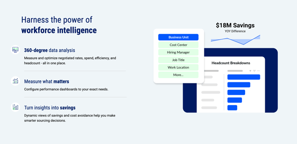
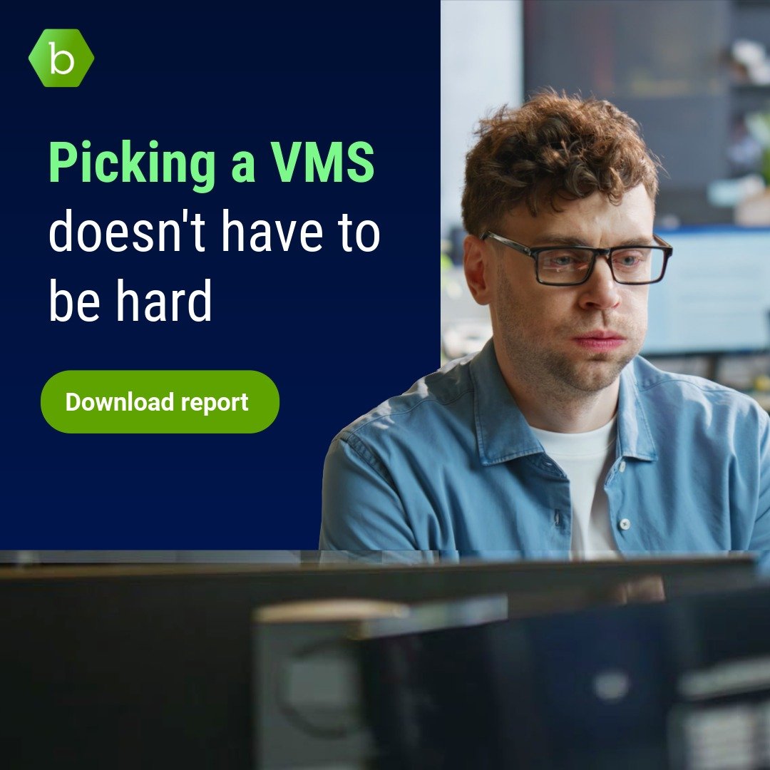
Please use photos of real people and places and avoid stock illustrations. Simple and clean UI elements and style may be used.

Examples

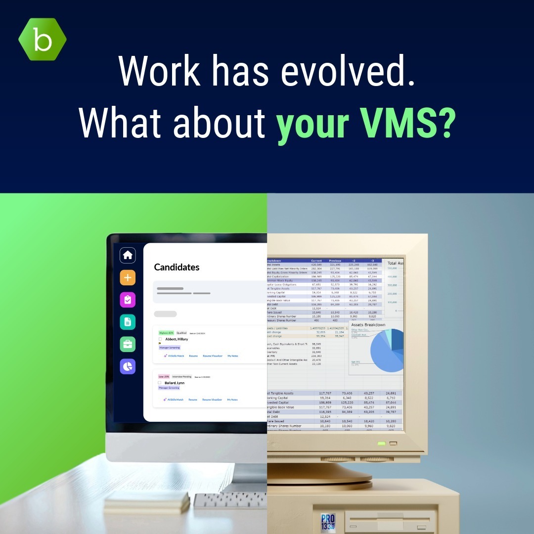
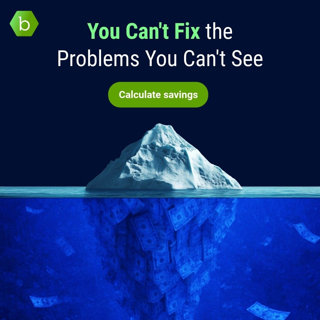
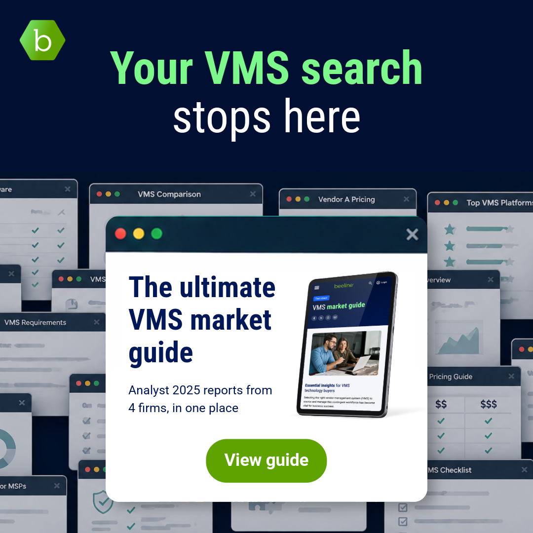
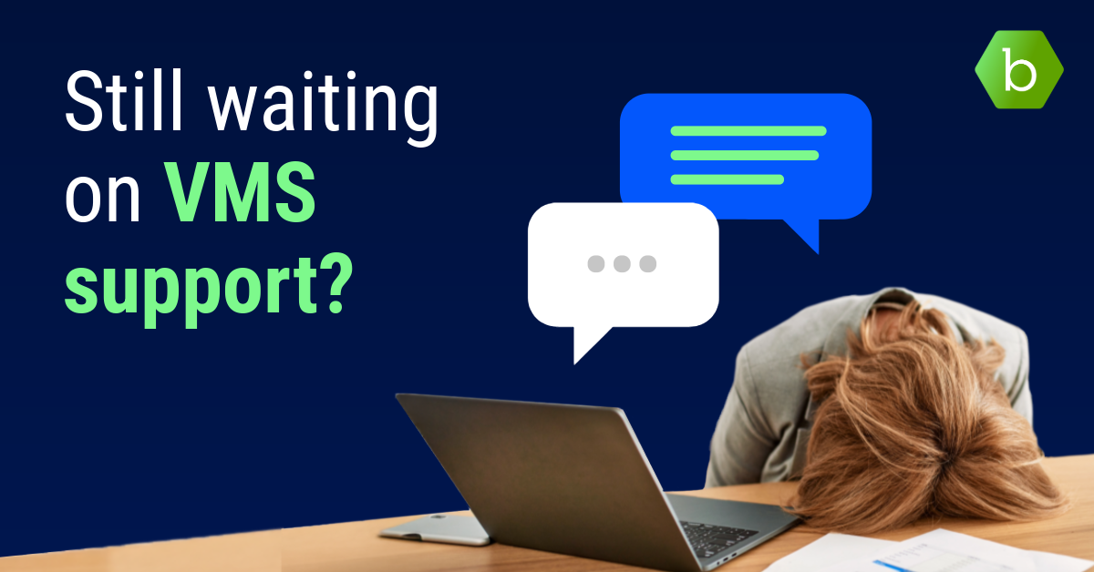
Gen 1 Lead-gen refresh Ad 3A-Social 1080x1080 v4 CTA
Gen 2 switch M&B Ad1-Social 1080x1080 Ad1
Gen 1 Lead-gen refresh Ad 2A-Social 1080x1080 v1 CTA
Gen 1 Lead-gen refresh Ad 3B-Social 1080x1080 v3 CTA
Gen 2 switch M&B Display Ad2-2-Social 1200x628

Social


Coming soon

Print & events


You can download our print guide here.

Beeline Lounge at Oak Cliff II

Events

We aim for a sophisticated, elegant and warm look for our events. 

  • Incorporate our Navy through furniture and furnishings

  • Incorporate green through plants and foliage

  • Use booths, screens and signage for additional branding
  • Use wood elements, lighting and plants to bring warmth

Semantic Messages


Error message is Red - 20 #9A0C26 text on Red - 90 #FFE4E4 background
Action required message is Orange - 20 #8A5100 text on Orange - 90 #FFEFD8 background
Success message is Pine - 20 #207B40 text on Pine - 80 #DCFAE6 background

Forms


Coming soon